
First product designer at a YC-backed fintech
Making cryptocurrency easily accessible
Founder Designer
YC W18
Web3 & DeFI
Design System
UX & Growth
Web & Mobile
How might we
make crypto and tax data clear for new crypto users?
How might we
create one experience across wallets, exchanges, and DeFi?
How might we
build a design system that scales with product and team?
The context
When I joined CoinTracker, the company had strong engineering talent, product momentum, and a fast-growing user base. What it didn’t have was a dedicated design function. I became their first product designer, working directly with the co-founders to establish design as a core discipline inside the company, not an afterthought applied at the end of each sprint.
CoinTracker had already raised significant funding, partnered with Y Combinator and Intuit, and was tracking over $50 billion in assets for more than 2 million users across web, iOS, and Android.
The challenge
The product operated at the intersection of financial data and cryptocurrency complexity. Users needed to connect and reconcile data from dozens of wallets and exchanges, track DeFi positions, understand liquidity pool transactions, and produce accurate tax reports - all within a single platform.
The challenge wasn’t just making things look cleaner. It was making inherently technical and high-stakes workflows accessible to both first-time crypto users and experienced traders, without compromising the precision that power users depended on. The web and mobile applications had diverged in interaction patterns, visual language, and feature capability, creating inconsistency across the same user’s journey.
What I owned
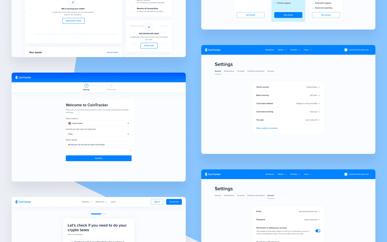
As CoinTracker’s first and only designer, I owned the design function end to end. That meant establishing process where none existed, designing the core product, and supporting growth in parallel.
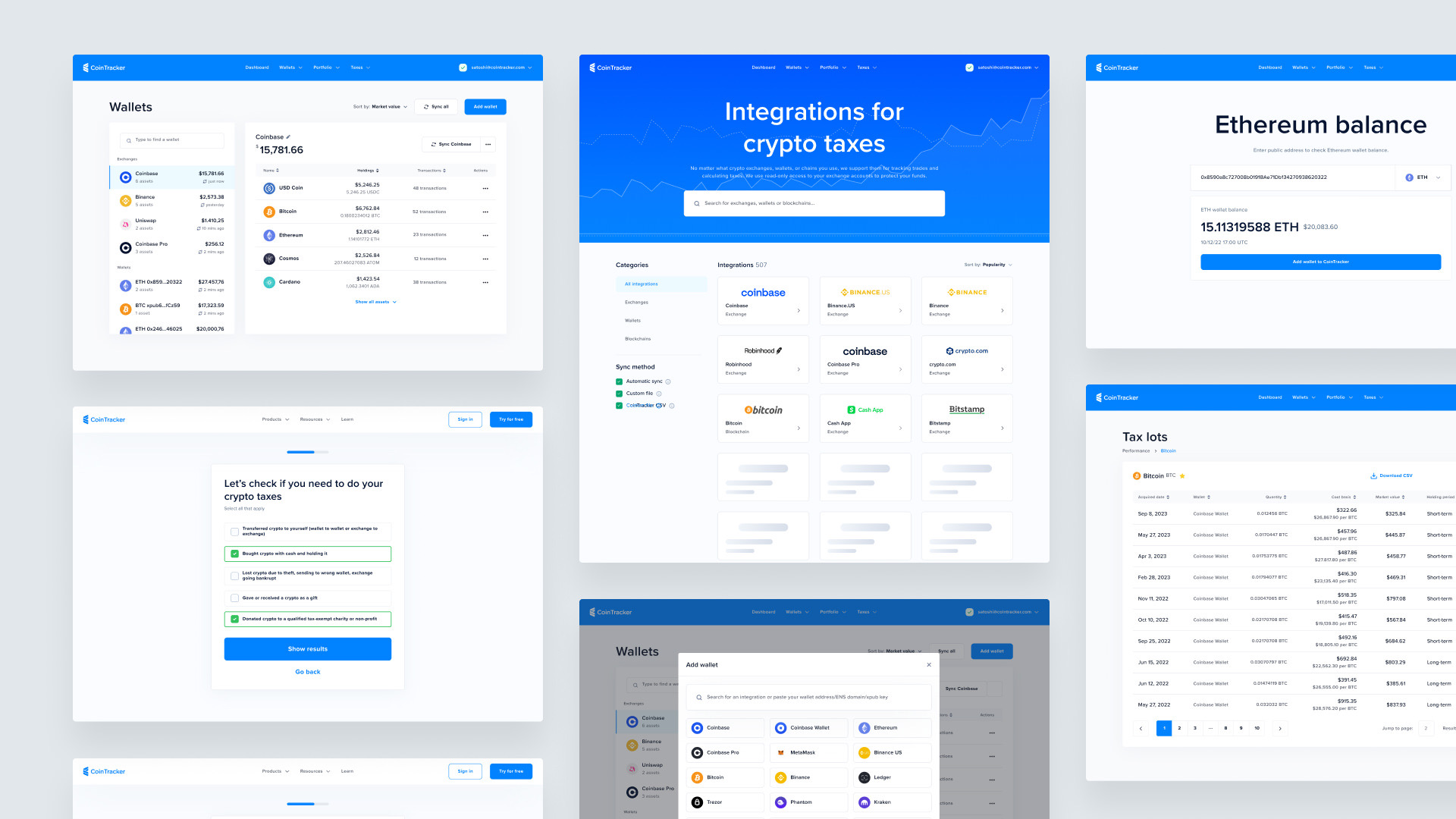
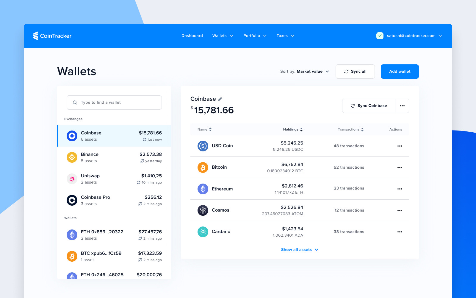
I built CoinTracker’s design system from scratch across web, iOS, and Android. I designed and iterated on the Integrations pod, the core of the product. I ran design workshops with the founding team to align on priorities and direction.
I collaborated directly with engineers to ensure design decisions translated into the product accurately. I supported the Growth pod with UX experiments aimed at improving sign-up conversion. I established design principles and review processes that the team continued to operate after my engagement.
Building the design foundation
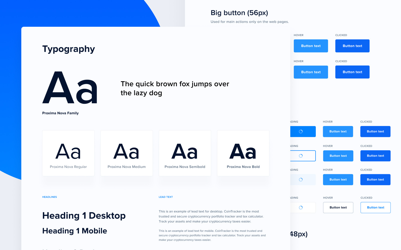
One of my first priorities was creating a shared design system. Before this, web and mobile had been built with divergent components and no common visual language. Design decisions were made inconsistently at the engineering level, and small UI differences accumulated into a fragmented experience.
I established a token-based system with reusable components across both platforms. Rather than building in isolation, I aligned it directly with the engineering stack so components could be adopted without translation overhead. The design system reduced inconsistency across the product and gave engineers a reliable foundation to build new features without waiting for per-feature design review.
Growth experiment - wallet balances page
Problem: The wallet balances page attracted substantial organic traffic from users arriving without an account to check their holdings. The page generated views but almost no sign-ups.
Approach: Working with the Growth pod, I focused on what these visitors needed at that moment in their journey. The page showed data, but it wasn’t clearly demonstrating the value of creating an account.
Design decision: Instead of adding a generic sign-up prompt, I restructured the page to surface what registered users unlocked: full portfolio visibility, tax workflows, and exchange integrations. The goal was to make sign-up feel like unlocking value rather than hitting a wall.
Outcome: The redesign improved conversion from browsing visitors to registered users. Exact figures are confidential, but the experiment became one of the growth initiatives the team continued to build on, and it showed how focused UX decisions on a single page can influence acquisition.
Impact
By the end of my engagement, CoinTracker had a complete design system covering web, iOS, and Android, built, documented, and handed off to an internal team. The Integrations pod, which I designed end to end, became the core product flow where users connected wallets, exchanges, and DeFi protocols to generate accurate portfolio and tax data.
The company scaled to over 2 million users, tracked more than $50 billion in assets, and raised $100 million in funding. Design was no longer an afterthought. It was part of how the product competed and scaled.
Why this project is relevant
CoinTracker happened to be a crypto company. The challenges weren’t.
The work was about turning a technically complex product into something people could trust and use confidently, while building the design foundations that allowed the team to scale.
Those are the same problems I solve today for SaaS, fintech, and AI companies: simplifying complex workflows, creating scalable design systems, and partnering closely with founders and product teams as their products evolve.
"We solve the crypto portfolio tracking and tax problems better than anyone else. One of the keys to our success has been the focus on user experience and simplicity."