
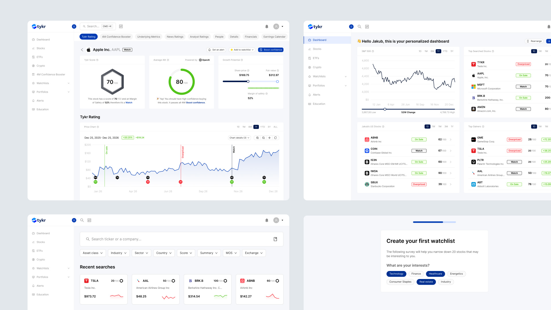
Reduced churn from 11% to 2.5%
Educating investors to take their first steps
Fintech
Product Redesign
AI Experience
Churn 11% → 2.5%
Onboarding
Growth
Web & Mobile App
How might we
make investing education easier to act on?
How might we
reduce churn by making the product more sticky?
How might we
help first-time investors build confidence without overwhelming them?
The context
When I started working with Tykr, the platform had a clear value proposition - help everyday investors make better stock decisions using a proprietary algorithm, but the product was not translating that value clearly enough to gain and retain users. Churn was running at 11%, and the founder had over a year of research pointing to the same root cause: the product was too complex for the audience it was built to serve.
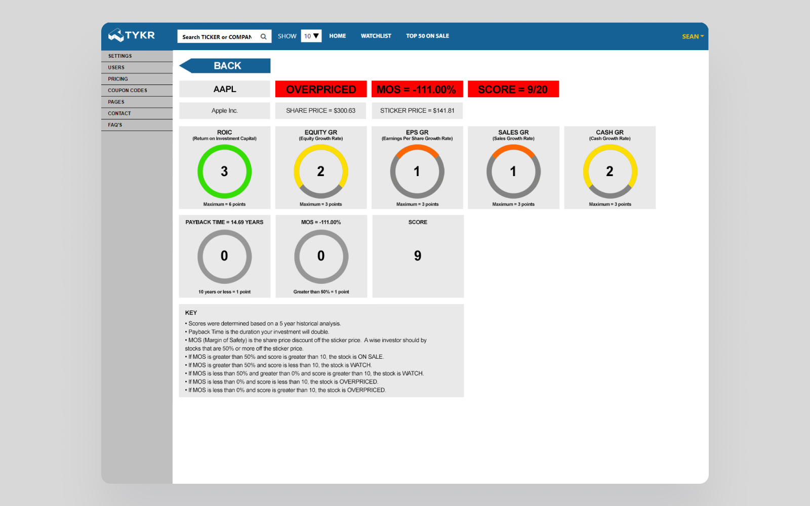
Tykr had already built a strong foundation: a scoring system that analysed stocks across metrics like return on invested capital, equity growth, and net income, and surfaced their own summary system: On Sale, Watch, or Overpriced. The logic was in place, but the presentation was not.
The challenge
The core issue in Tykr's product was between complexity and ease of use. Their own algorithm was sophisticated, and surfacing the full data gave power users what they needed. But for first-time investors, which is the primary audience the same data created anxiety rather than confidence.
Users were arriving, reading numbers they could not interpret, and leaving before the product had a chance to demonstrate its value. The challenge was not improving the algorithm. It was making its output readable, trustworthy, and actionable for someone who had never invested before.
What I owned
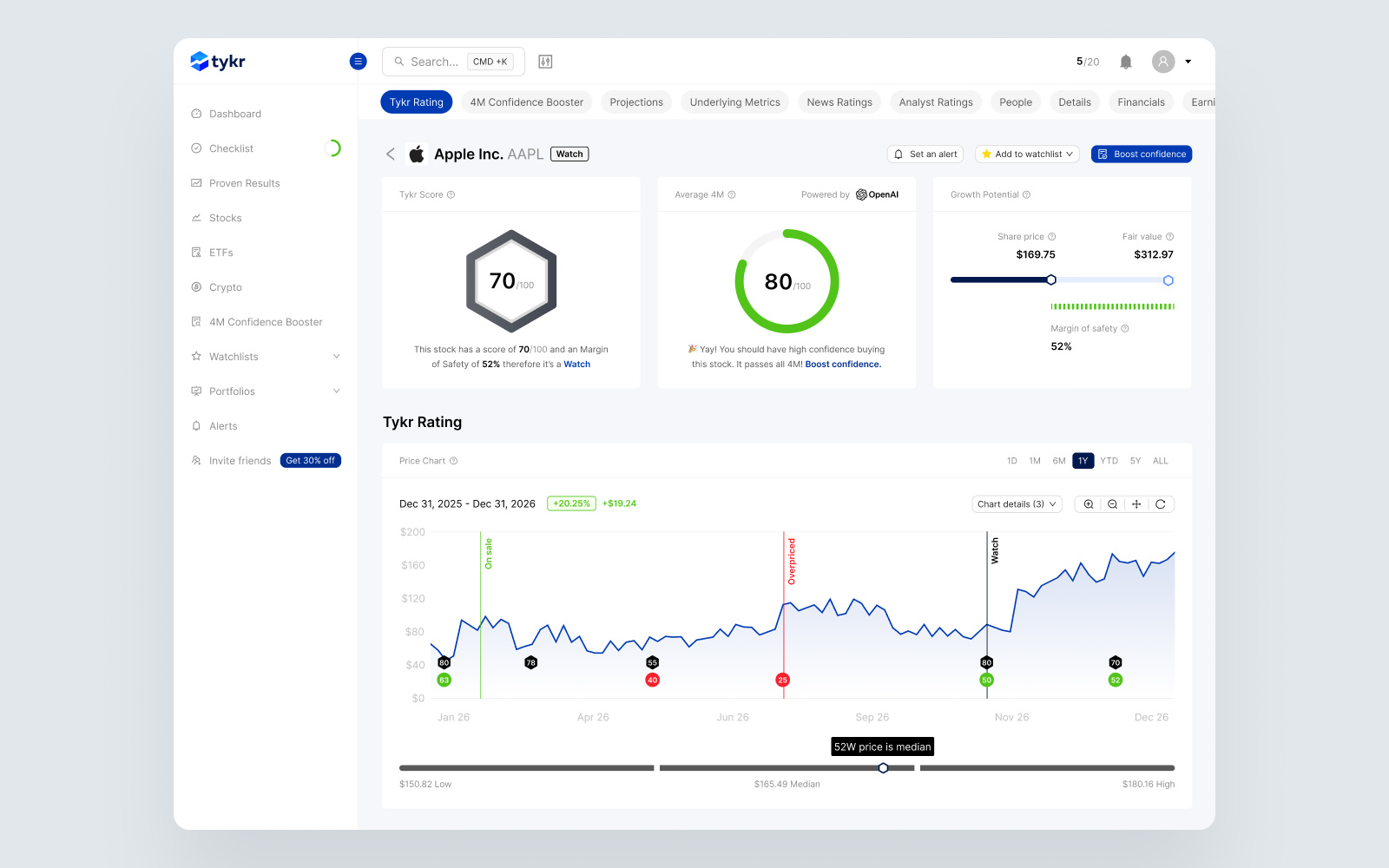
I owned the visual and interaction design of the platform across web, iOS, and Android. I worked directly with the founder, using user research already gathered over the previous year as the foundation for every design decision.
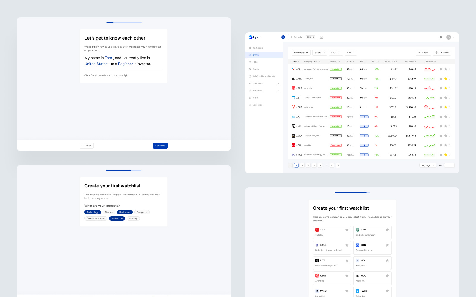
I redesigned the whole platform, including the dashboard, onboarding flow, ETF page, and watchlist to reflect how beginner investors actually make decisions: incrementally, needing reassurance at each step. I introduced a clearer visual hierarchy that surfaced the Tykr score and investment verdict before the supporting data, so users could orient themselves without reading every metric first.
I added personalisation features, like a custom dashboard, watchlists, and personalised email newsletters - to give users a reason to return during periods when market conditions were not in their favour.
Tykr meets AI
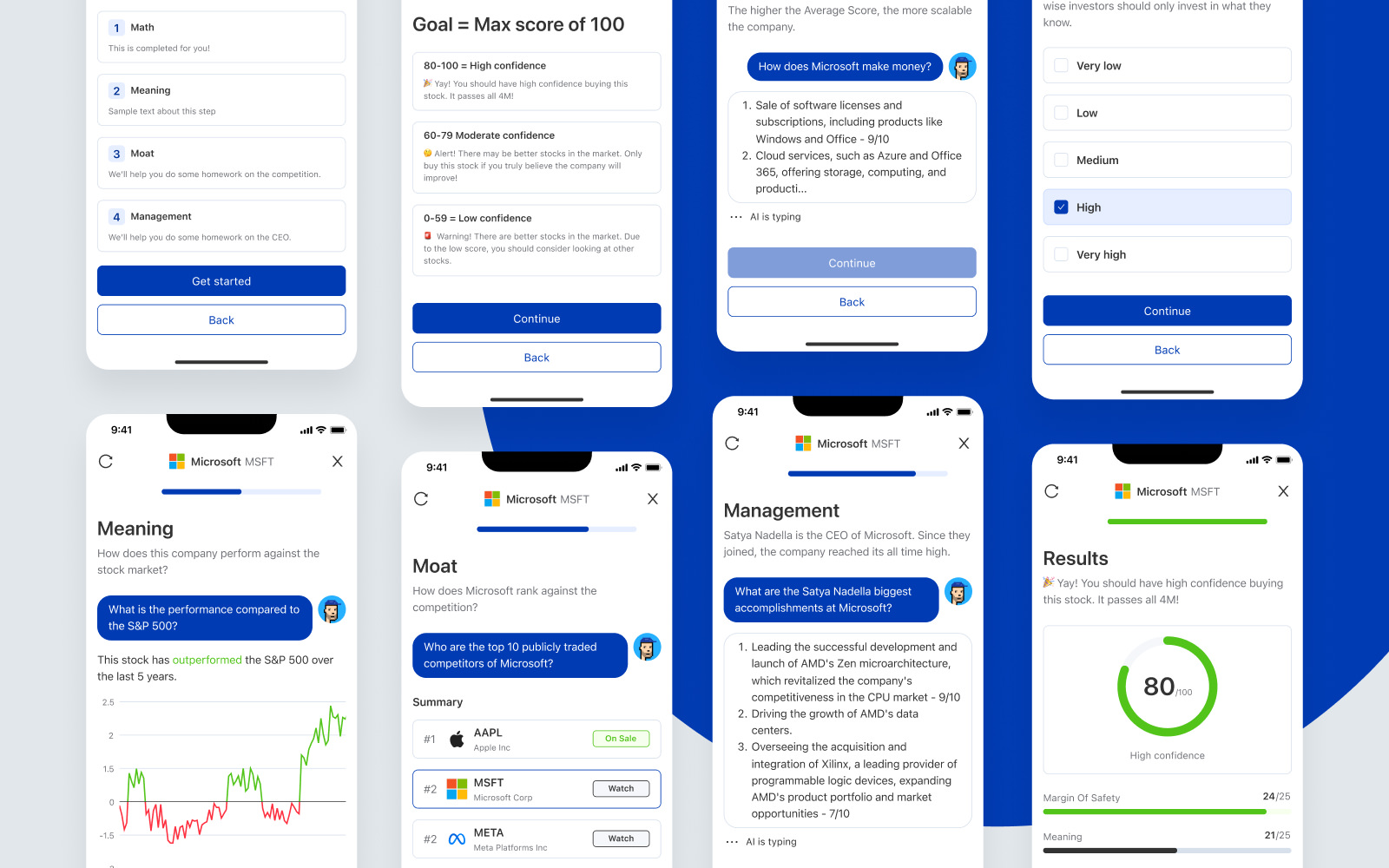
Problem: A complete 4M analysis - covering a stock's Maths (Tykr Score and Margin of Safety), Meaning (business model and revenue streams), Moat (competitive position), and Management (CEO and board track record) - took investors an average of 82 minutes to complete manually. Most users never finished it, which meant they were making decisions without the full picture.
Approach: The team's instinct was to improve the analysis process first, then find where technology could accelerate it - not the other way round. I worked with the founder to map the 4M workflow and identify where users stalled, lost context, or abandoned the process mid-way.
Design decision: I designed the interface for an AI-powered version of the analysis that automatically generates a clear, human-readable breakdown of all four pillars for any stock. The output uses the same structure users already knew from the manual process, so trust transferred immediately. The goal was to make a deep analysis feel like a starting point, not a finish line.
Outcome: The 4M Confidence Booster reduced the time to complete a full analysis from 82 minutes to around 6 minutes. Users who previously skipped the analysis began completing it, giving them a stronger basis for their investment decisions.
Impact
After the redesign, churn dropped from 11% to 2.5%. Monthly recurring revenue increased. The product development process became more structured, enabling the team to ship features faster without losing visual consistency.
The redesign also gave the team a clearer framework for translating complex investment logic into decisions users could confidently act on.
Why this project is relevant
Tykr happened to be about stocks. The core problem was not.
The challenge was making a technically complex product clear enough that users build confidence and stay, drives churn in SaaS, fintech, and AI products across every vertical. The financial concepts were specific to Tykr. The design patterns for reducing cognitive load, building trust through hierarchy, and keeping users engaged during low-activity periods are transferable to any product where complexity is a retention risk.
The outcomes here - measurable churn reduction and revenue growth - are what good UX decisions produce when they are tied directly to how users experience value.
“We needed a design that was easy to understand for new investors and, at the same time, kept them coming back more frequently. The designs that Jakub provided knocked this out of the park! Our churn dropped, and MRR increased”